My exploration of Tableau began with a series of on-demand video tutorials available to registered users on the Tableau website. I started by downloading their sample data set and following along with the training videos.
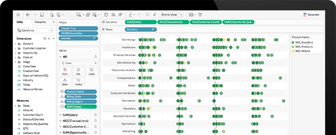
Right from the beginning, I was quite impressed with the fairly intuitive user interface of this piece of software, which supports the creation of a wide variety of data visualizations without any knowledge or experience in coding or programming. Tableau can connect to a multitude of different data file types and databases – from basic excel or text files, to data hosted on a variety of different servers (e.g. Amazon Redshift, MySQL, Google Analytics etc.). The visualizations that Tableau generates from these data are updated in real-time as changes are made to the original data files/databases.
Playing With Data
The data set that was provided as part of the tutorial represented sales data for a “Global Superstore,” which was imported from an Excel file. Upon importing the data, variable headings and variable types are automatically generated, but are easily editable if changes need to be made. For example, Figure 1 shows what the recently imported Excel file looks like once imported into tableau. At the top, you can see that the connection is set to “Live,” such that changes to the Excel file will be reflected in Tableau’s visualization output. Below, the data appears. In Figure 1, you can see that I have changed the ‘data type’ for “Order ID” from “number” to “string.”

When the data are set, the fun part begins. Clicking the “Sheet” tab at the bottom takes you to a new Tableau work area where the visualization work happens. Along the left side-bar, the variables have been split into “dimensions” (i.e. qualitative or descriptive variables) and “measures” (i.e. quantitative variables) (see Figure 2). Building a visualization is simply a matter of dragging and dropping different “dimensions” and “measures” onto different axes of the workspace. For example, in Figure 2, I have chosen to depict the profits and sales of the “Global Superstore” based on their geographic region (latitudes and longitudes were automatically generated for each city by Tableau). Here, the colour of the circle represents total profits, and the size of the circle represents total sales. Additionally, I have chosen to filter the data by furniture sales only (i.e. sales of other products are not shown here). This graphic is interactive, such that clicking on any of the circles will reveal further information about that data point.

I should also note that based on the variables that I have chosen, Tableau will recommend the type of visualization that is most conducive to displaying or representing that information
This particular data set could be used to tell a number of different ‘stories’ about sales, profits, products, geography, or time of year (to name a few). One of my favourite features of Tableau is the “stories” feature. After creating several different “sheets,” the user can publish these as an interactive “story,” using text/captions to supplement what is shown in the visualization. Here are some examples of “stories” that other users have generated (see, in particular, “Austin’s Teacher Turnover”).
Publishing Tableau Visualizations
The best way to share the interactive stories and visualizations online with a restricted audience or group of collaborators would be to purchase Tableau Server or a subscription to Tableau Online. One may also save/export a Tableau workbook that may be opened by someone who also has the Tableau Desktop software, or who has Tableau Reader (free). However, while the Tableau Reader software preserves the interactivity of the visualizations, they are not editable with the reader. One may also export visualizations as image files or PDFs, however, these are entirely static (i.e. no interactivity)
Closing Thoughts on Tableau
Overall, I was quite impressed with Tableau’s ease-of-use and functionality. Based on my limited experience, one area of weakness (for my own research purposes) is that it doesn’t seem to handle social data – e.g. social graphs, social networks etc. It can show things like sequence of publishing notes (e.g. a timeline), or the frequency of note publications (see Figure 3), however it doesn’t depict who was interacting with whom, including build-ons or other discourse moves.

This post is part of a series in which I reflect on my experiences as a first-time explorer of various pieces of learning analytics and data mining software applications. The purpose of these explorations is for me to gain a better understanding of the current palette of tools and visualizations that may possibly support my own research in learning analytics within the context of a face-to-face/blended collaborative learning environment in secondary science.
