 For the purposes of this exploration, I am using a 14-day free trial version of the cloud version of DSS, which includes several tutorials for new users.
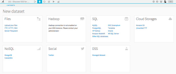
DSS enables users to import data from a variety of sources (see Figure 1), however the dataset must be in tabular format – i.e. an SQL Database is not considered a dataset, but a SQL Table is. There are settings that can be set in DSS so that whenever the original data changes, the corresponding dataset in the Studio is automatically updated.
Figure 1 – Data sources available for import in DSS

Playing With Data
DSS automatically detects the variable type (or “meaning,” to use their lexicon – e.g. text, number, date (needs parsing) – see Figure 2). Additionally, the gauge at the top of each column shows users where there is invalid data (shown in red). Users can transform the data – for example, fixing/removing invalid entries, merging categories, changing data types, etc. – and each of these transformations can be recorded into a “script.” Figure 3 shows the script for the transformations I performed with the sample dataset “haiku_shirt_sales.csv”. This script captures the history of all the actions that I have taken on the data set, allowing me to modify/delete a particular step that was taken earlier, and (optionally) generate a new dataset with all the transformations.
Figure 2 – Variable types
Figure 3 – Script showing transformations performed on the sample dataset, “haiku_shirt_sales.csv”
DSS allows users to generate charts based on the dataset. However, as far as I can tell, the charts are static (i.e. non-interactive), and can only be exported as image files. Figure 4 shows an example of a stacked bar chart I created with the “haiku_shirt_sales.csv” dataset. On the left-hand side, you can see the different chart options that are available in DSS (quite basic in comparison to Tableau). Ultimately, the strength of DSS is not its visualizations, but rather its ability to generate predictive models.
Figure 4 – Stacked bar chart created with “haiku_shirt_sales.csv” dataset. Other available chart types are shown on the left.
Creating a Machine Learning Model
Using the sample dataset provided (registered members of a fictional T-Shirt company called “Haiku”), the purpose of the model created through this tutorial was to predict whether a new customer will become a high-value customer after one year, based on the information gathered during their registration.
After importing the dataset “interactions_history,” the column for “high revenue” is selected and under the drop-down menu, you choose “Create prediction model.” By default, DSS compares two classes of algorithms: a simple linear model (logistic regression), and a more complex ensemble model (random forest) (see Figure 5).
Figure 5 – Default regression models compared in DSS (Random Forest Model and Logistic Regression Model)
Here, the Random Forest model seems to be the most accurate since the AUC (Area Under the ROC Curve) is 0.949 (the closer to 1, the better). Selecting the Random Forest Model, and then displaying the model by “variable importance” shows that the best predictor of whether a customer will be high-value is the value of the first item they purchase (see Figure 6).
Figure 6 – Random Forest Model, sorted by “variable importance” shows that the variable “first_item” is the best predictor of a high-value customer.
The tutorial continues, however my need for a refresher in modelling and statistics means that I would need to invest more time than I currently have available into understanding the nuances of this software.
This post is part of a series in which I reflect on my experiences as a first-time explorer of various pieces of learning analytics and data mining software applications. The purpose of these explorations is for me to gain a better understanding of the current palette of tools and visualizations that may possibly support my own research in learning analytics within the context of a face-to-face/blended collaborative learning environment in secondary science.
