Gephi is an open-source software application used for visualizing and analysing (large) network graphs. Figure 1 shows the types of data formats that can be imported into Gephi. The GEXF format (Graph Exchange XML Format) was created by members of the Gephi project and offers the most functionality; it is one of the two formats (other than spreadsheet) that can display/save/export dynamic data (i.e. data that changes longitudinally over time).

For the purposes of this exploration, I downloaded Gephi Version 0.8.2-beta and followed the three ‘official’ tutorials: “Quick Start Guide,” “Tutorial Visualization,” and “Tutorial Layouts.”
Playing With Data
The sample data set I used was a GML file called “Les Miserables,” which contains a co-appearance weighted network of characters in the novel Les Miserables. The tutorial first teaches how to prepare and format a network visualization using the dataset. Figure 2 shows the “force atlas” network visualization I created from the Les Miserables dataset, with customized edge thickness, colour configurations (according to ranking), and repulsion strength. The “results” data table on the left sidebar shows that the character “Valjean” (shown in the centre of the graph) has 36 links and is the most connected character in the network.

Next, I ran some statistical processes, starting with “Average Path Length.” This produced a graph distance report showing the ‘betweenness centrality distribution,’ ‘closeness centrality distribution,’ and ‘eccentricity distribution’ of the graph (see Figure 3).

Betweenness centrality is an indicator of a node’s centrality in a network. It is equal to the number of shortest paths from all vertices to all others that pass through that node. A node with high betweenness centrality has a large influence on the transfer of items through the network, under the assumption that item transfer follows the shortest paths.
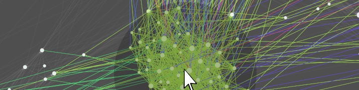
The next thing I did was apply the rank parameter “betweeness centrality” to the visualization such that the size of the nodes reflected the degree of betweenness centrality (i.e. the larger the node, the greater the betweenness centrality). Then I added node labels and adjusted the size of the labels to be proportional to the nodes (see Figure 4).

Community Detection
Gephi uses the “Louvain method” (Blondel et al, 2008) to detect and study communities within a network. To detect communities, I ran a process called “modularity,” which created a “modularity class” value for each node. Next, I used the “partition” module to colorize communities based on the modularity class data. As shown in Figure 5, a total of 5 communities were detected and each was assigned a (random) colour.

The only export options available for the final graphic are image files (SVG, PDF, or PNG). Below is the final graph I exported as a PNG file.

Closing Thoughts
Gephi is a tool I would like to continue learning about and exploring further. It would be useful to have dynamic social network graphs that update in real-time (which is possible with the GEXF file format), however it seems that the resulting product graphs can only be opened/viewed/edited using the Gephi software itself (i.e. dynamic graphs cannot be hosted/embedded/shared anywhere online – only as static image files). The “Louvain method” for community detection (Blondel et al, 2008) is also something that I would like to investigate further.
This post is part of a series in which I reflect on my experiences as a first-time explorer of various pieces of learning analytics and data mining software applications. The purpose of these explorations is for me to gain a better understanding of the current palette of tools and visualizations that may possibly support my own research in learning analytics within the context of a face-to-face/blended collaborative learning environment in secondary science.
References:
Blondel, V., Guillaume, J., Lambiotte, R., Mech, #. (2008). Fast unfolding of communities in large networks. J Stat Mech. Theory Exp 2008: P10008. http://arxiv.org/pdf/0803.0476v2.pdf
